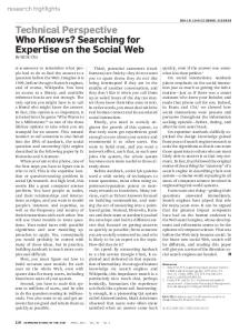
Effective Web Searching on Mobile Devices Kerry Rodden, Natasa Milic-Frayling† , Ralph Sommerer† & Alan Blackwell‡ Instrata Ltd, 62 Kingston Street, Cambridge CB1 2NU, UK Email:
[email protected] †
Microsoft Research Ltd, 7 J J Thomson Avenue, Cambridge CB3 0FB, UK Email: {natasamf, som}@microsoft.com ‡ University
of Cambridge Computer Laboratory, 15 J J Thomson Avenue, Cambridge CB3 0FD, UK Email:
[email protected]
Web pages with complex layout do not display well on small screens, and require extensive amounts of scrolling, both horizontally and vertically. This quickly leads to disorientation within the page. In order to make optimum use of the small displays on mobile devices for Web browsing and searching, it is necessary to enforce both overview and detail concerns of page viewing. However, this typically requires two different visual renderings. SmartView provides an overview in the form of a zoomed out image of the page, with outlines segmenting it into detail regions; the user can select any of these regions in order to view it separately from the rest of the page. The content in the selected region is reformatted to fit the display, reducing any scrolling to a single direction. SearchMobil extends this approach with the aim of providing support for searching: pages retrieved by a search engine are displayed in an overview that is annotated to show the locations of search terms. We carried out a user study to compare SearchMobil’s page representation to the one currently used in Pocket Internet Explorer, with a special emphasis on exploring the impact of page structure and query term selection on its effectiveness. Keywords: PDA, handheld, mobile device, World Wide Web, searching, browsing, overview plus detail, page viewer, evaluation.
2
Kerry Rodden, Natasa Milic-Frayling, Ralph Sommerer & Alan Blackwell
Figure 1: A Web page with complex design, as seen on a Pocket PC. Only a small area can be shown in detail, and the overview (the rest of the page) only becomes visible through scrolling.
1 Introduction Mobile devices (such as PDAs and smart phones) have small screens. Yet most HTML pages are designed with the assumption that they will be displayed on a
standard desktop screen, meaning that they can be difficult to view on a mobile device (e.g. Figure 1). Ideally, Web authors could use a generic document description format that would allow flexible and adaptive layout of document content on various devices. Such a format does not yet exist, however, so authors must create different versions of a page to suit particular target devices (e.g. using Wireless Markup Language), or Web browsers on mobile devices must be capable of dynamically modifying page appearance.
1.1 Overview Plus Detail Generic solutions to the problem of viewing large amounts of information in a small area are known as overview plus detail displays [Card et al. 1999]. These enable the user to focus on a selected region, while maintaining a representation of his or her context within the whole, and allowing navigation to other regions of it. Such displays have diagrammatic properties that intentionally obscure or distort some part of the content in order to make the relationship between overview and detail explicit [Carpendale et al. 1997]. Every such visual representation emphasizes some aspects of the structure or content while obscuring others [Green et al. 1991; Petre et al. 1998]. The overview and detail might be displayed simultaneously in different parts of the screen, or separately. A very simple example of an overview plus detail mechanism is the scrollbar, which is used most widely on mobile devices at present. However, the right trade-
Effective Web Searching on Mobile Devices
3
off between readability of the content and the amount of horizontal and vertical scrolling required to view a page is very difficult to achieve. Restricted view and need for extensive scrolling has been linked to impoverished performance in information seeking tasks on small devices in comparison to devices with standard screen size [Jones et al. 1999, 2002]. When viewing Web content on a mobile device, there are three common situations in which overview plus detail concerns can arise: The detail region is a portion of a Web page, and the structure of the page provides the overview for navigation within the page. The detail region is a page within a site, and the structure of the site provides the overview for navigation to other pages. The detail region is a page in a set of search results (of varying potential relevance) that have been returned from a search engine, and the overview is the set itself. In this paper, we concentrate on the first and third of these situations.
1.2 Evaluation of Mobile Web Browsers Given the wide range of possible Web page layouts and Web activities, representations of overview plus detail are always more suited to some combinations of these than they are to others. This makes the evaluation of novel Web browsers rather difficult. One option is to run an evaluation exercise in which the browser is evaluated only with respect to pages and tasks that are known in advance to meet the assumptions of the browser designers. This type of study is relatively common; the reported results may be impressive, but they are not informative about the wider applicability of the new representation. An alternative is to explicitly recognize that all representational decisions will improve performance on some tasks while reducing performance on others. The ideal design is one in which relatively large improvements on some kinds of task are balanced by relatively small decrements elsewhere. But to establish that this is the case, it is necessary to explicitly evaluate new browsers with tasks or structures where the representation strategy is expected to fare poorly, as well as with those where it is expected to perform well. This is what we have done in this project, and we present it here as a case study and recommendation for other teams developing browser technologies.
2 System Description SmartView [Milic-Frayling & Sommerer 2002a,b] is a prototype application that takes a novel approach to the problem of displaying Web pages on mobile devices. It partitions a document into a number of regions, by analysing the layout structure of the underlying HTML. These regions are indicated to the user by superimposed lines on a thumbnail overview of the document, from which he or she can then select a region and read its content in a detailed view.
4
Kerry Rodden, Natasa Milic-Frayling, Ralph Sommerer & Alan Blackwell
Figure 2: SmartView — overview of the page layout, with logical regions outlined in green (left), and direct access to the detail regions of the page (right).
SearchMobil extends this approach to support the user in looking for a particular piece of information on the page, by annotating the regions to indicate how well they match given search terms, facilitating relevance assessment. We describe both of these applications in more detail, and then present a user study that focuses on the effectiveness of SearchMobil’s page annotations, exploring the impact of different document structures (as discussed in the previous section).
2.1 SmartView SmartView analyses the structure of an HTML page in order to segment the page into meaningfully separate detail regions, and present an overview of the structure in thumbnail form. HTML does not explicitly describe conventional layout features such as the multiple columns, sidebars, etc., that are commonly used in Web page designs. Web authors usually resort to HTML tables with fixed column widths and small blank images to express page structure. This results in rigid, inflexible, fixedsize Web page layouts that require a certain minimal amount of screen space and cannot be re-flowed to preserve the logical structure when viewed on smaller screens, such as those of mobile devices. Figure 1 depicts the front page of a news site, showing the portion of the page that can be seen using Internet Explorer on a Pocket PC. Note that the link bar on the left occupies more than half of the screen width of the Pocket PC, and that the scroll bars indicate that an extensive amount of both vertical and horizontal scrolling is required to see other parts of the page. Also, the main text body of the page (in the central column) is too wide to fit on the screen, thus requiring horizontal scrolling to read the text. Such overview and detail restrictions are inappropriate for most reading. In SmartView, we discover the logical structure of the page, so that it can be presented to the user in an overview. This involves analysing layout features such as the table format used to define the position of page elements. The page overview is
Effective Web Searching on Mobile Devices
5
Figure 3: SearchMobil, showing the results from a search for ‘elements typography’, where the user is currently viewing result 4. The overview (on the left) shows the logical segments of the page, annotated with the number of term hits; the region with most hits is outlined in red instead of green. The detailed view (on the right) shows a selected segment, with the query terms highlighted.
displayed with superimposed outlines indicating the segments (Figure 2, left). The user can navigate to a specific detail region by tapping on one of the outlined areas with the stylus. The corresponding segment is then extracted and presented in the browser window, re-flowed to accommodate the narrow screen of the mobile device (Figure 2, right). These individual text units can be presented as meaningful detail regions, because they are usually HTML fragments with a simple structure. Currently, the page structure analysis and thumbnail creation are implemented as a proxy service. However, it would also be possible to perform both locally on the device. Most previous research into Web browsing on mobile devices has focused on integrating overview and detail information into a single screen, using text-based summary representations of the page content [Buyukkokten et al. 2001; Trevor et al. 2001]. While there are many benefits of this approach, we believe that there is a value in delivering the content of a page as originally designed by the author, and maintaining an overview that gives a consistent look-and-feel of the pages across different devices. The more recent system of Chen et al. [2003] presents a page overview that is split into sections, but greatly changes the page’s original appearance by shading the sections in different pastel colours to differentiate them.
2.2 SearchMobil SearchMobil is intended to support the user in looking for information matching a requirement, in particular when he or she has submitted a query to a Web search engine, and is browsing through the results. It does this in two ways: While the search engine produces a ranking according to its estimate of which documents in the result set are most relevant to the query, SearchMobil provides an indication of which part of a particular document is most relevant
6
Kerry Rodden, Natasa Milic-Frayling, Ralph Sommerer & Alan Blackwell
to the posed query. It enhances SmartView by adding annotations to assist users in judging the relevance of each page region to the requirement, enabling them to quickly direct their attention to the most promising parts of a document. In the overview of a page, small squares are placed in each region to indicate the number of query term hits it contains, and the region with most hits is outlined in red instead of green (Figure 3, left). In the detailed view of a selected region, the query terms are highlighted (Figure 3, right), as in previous systems for supporting document reading [Graham 1999] or Web browsing [Milic-Frayling & Sommerer 2001] on desktop computers; these terms will often mark important contextual locations within the page. These enhancements are facilitated by local or proxy-based processing of the documents retrieved by the search engine. The set of the top ten result pages is automatically downloaded, and is itself presented in an overview plus detail form: a tabbed ‘booklet’, as shown in Figure 3. The tabs along the right-hand side of the page provide an overview indicator that shares the screen with the current detail region, thereby allowing direct access to each search result. When the user taps on one of the tabs, he or she is presented with the annotated overview of that document. The user can also choose to be taken directly from the booklet view to the best scoring logical unit on the given page, instead of the overview. The SearchMobil interface also provides a local search facility, so that the user can carry out a refined search over the set of documents returned by the search engine. If a document matches the local search, the colour of its corresponding tab in the booklet is changed to red. This facility may be helpful if the user’s requirement is initially vague, but becomes more specific as he or she reads through some of the results.
3 User Study In order to test our hypothesis that query-specific overview and detail views of a page (like those in SearchMobil) would be helpful to users, we carried out a user study to compare them to Pocket Internet Explorer’s default presentation. As we have already discussed, certain user tasks and page or site structures are likely to emphasize the benefits of particular rendering and navigation strategies for overview plus detail. Studies of Web usage have found that there is a wide range of different types of activity; Sellen et al. [2002], for example, identified six main categories, of which those related to Web searching were ‘finding’ (looking for something specific and well-defined) and ‘information gathering’ (researching a topic, e.g. to compare alternatives and make a decision). As in previous studies of Web browsing on mobile devices [Buyukkokten et al. 2001; de Bruijn et al. 2002; Jones et al. 1999], we opted for a finding task (locating the answer to a set question), as this offers more control to the experimenter than an open-ended information gathering task. To further reduce variability, we also chose to use a single Web page per task. As we mentioned in Section 1.2, unlike previous researchers we deliberately chose some tasks that did not suit our prototype system, as well as some that did,
Effective Web Searching on Mobile Devices
7
in order to explore the advantages and disadvantages of our overview plus detail strategy. We hoped to find that the improvement in performance with the favourable tasks was greater than the decrement with the unfavourable tasks. When carrying out a ‘finding’ task using a search engine, the user must enter some query terms, which form only a partial representation of his or her actual requirement. When looking at a retrieved page that contains relevant information, the user must be able to identify and locate it on the page, and so the effectiveness and efficiency of this process depends on the positioning and prominence of the relevant information. Techniques such as query term highlighting can be helpful here, but their usefulness depends on how close (both in terms of representation and location) the user’s query is to the information that satisfies his or her actual requirement. The same applies to the highlights on SearchMobil’s page overview, and its indication of the region containing most hits; for these to be helpful, the query terms and the relevant information need to co-occur within the same layout element of the page. This observation was essential to our experiment design. Based on the structure of the Web page containing the answer to the question, and the particular search terms used, we split the tasks into three groups: Type X: Where the answer page can be divided up into sections by SearchMobil, and where the correct answer is in the section that is outlined in red in the overview (i.e. marked as most relevant, according to the search terms used). We expected SearchMobil to perform better than Pocket IE in these tasks. Type Y: Where the answer page has only a single section. We expected that SearchMobil would perform slightly worse than Pocket IE in these tasks, because the overview adds no additional information to the detail view. Type Z: Where the answer page can be divided up into sections by SearchMobil, and where the correct answer is not in the section that is outlined in red in the overview. One situation where this can arise is when the user has entered search terms that are more general than his or her actual requirement. For example, the goal of task Z2 is to find the postal address of the charity ‘Shelter’, but the search term is simply ‘shelter’, and thus in the SearchMobil overview (shown in the bottom right of Figure 4), the main part of the page is marked as most relevant, not the sidebar on the left that contains the address. We felt that because the participants were being directed to a section that did not contain the correct answer, SearchMobil would probably perform slightly worse. The 12 questions we used are listed in Table 1; they were drawn from TREC-9 and TREC-10 [Voorhees 2001], and are based on logs of Web search engine usage. We selected the search terms ourselves and submitted them to Google, and the answer pages were all taken from the top ten results for those terms. We favoured questions where it was unlikely that the participants would already know the answer, and adapted some of the questions to make them more suited to a UK audience. We favoured pages where the answer was stated unambiguously, without requiring interpretation by the participants.
8
Kerry Rodden, Natasa Milic-Frayling, Ralph Sommerer & Alan Blackwell
Pocket IE
SearchMobil
X
Y
Z
Figure 4: Examples of the three types of task, showing the portion of the answer page that was visible without scrolling, for both types of browser. In the SearchMobil overviews, the recommended region is outlined in red, with two yellow squares in the top right corner.
Effective Web Searching on Mobile Devices
9
Question and search terms
ID
How many hexagons and pentagons are there on a football? hexagons pentagons football How tall is the Sears Tower, in feet? sears tower height In which year did Hawaii become a state of the USA? hawaii became state Who is credited with inventing the paper clip? paper clip invented What is the salary of a UK member of parliament? uk mp salary How many miles is it from London to Plymouth? miles london plymouth How much was a third-class ticket for the ship ‘Titanic’? titanic ticket cost Which polymer is used to make bulletproof vests? polymer bulletproof How long is the average elephant pregnancy? elephant pregnancy What is the telephone number of the University of Sussex? university sussex What is the postal address of the charity ‘Shelter’? shelter Which metal has the highest melting point? metal highest melting point
X1 X2 X3 X4 X5 X6 Y1 Y2 Y3 Z1 Z2 Z3
Table 1: The questions (and their associated search terms) used in the experiment.
After pilot studies, we decided to modify the indication of search term hits on the page overview. The region with most hits contains two yellow squares, and other regions with hits contain one yellow square (instead of using one yellow square per hit). We also chose to place them in the top right of the region instead of the top left, as this made them less likely to obscure any text at the top of the region. The change can be seen by comparing the overviews in Figures 3 & 4.
3.1 Method 3.1.1 Participants We used 24 participants, all with normal or corrected-to-normal vision (selfreported). 16 were male and 8 female, and they ranged in age from 20 to 42. As in the previous studies by others, all of our participants had a computing background (the majority were undergraduate students in computer science), and all considered themselves to be experienced Web users.
3.1.2 Materials The participants used a Compaq iPAQ 3760, running Microsoft Pocket PC. The answer pages were all cached on the iPAQ, so no network connection was required,
10
Kerry Rodden, Natasa Milic-Frayling, Ralph Sommerer & Alan Blackwell
and the experimental timings could not be affected by network performance. We generated a question page for each task, which presented the question in a hyperlink to the answer page, with the original search terms given in italics below it (as in Table 1). We also generated an additional page for each participant, which contained one hyperlink to each of the question pages, in a random order. We used a stopwatch to record the time taken to find the answer to each question.
3.1.3 Design As previously discussed, we chose 6 tasks where we expected SearchMobil to perform better than Pocket IE (Type X), and 6 where we expected it to perform worse (3 of Type Y, and 3 of Type Z). Because of this anticipated interaction between task and interface type, we used a between-subjects design (half of the participants used Pocket Internet Explorer alone, and half of them used Pocket IE with the SearchMobil overview of the answer page). All participants did the same 12 tasks, which were presented in a different random order for each participant.
3.1.4 Procedure After reading the instructions and filling in an initial questionnaire, the participants were shown how to use the Web browser on the Pocket PC, and were walked through an initial practice question. The participants who were assigned the SearchMobil view were given an explanation of its features and were shown how to use it. Then, all of the participants did two more practice questions on their own. The first practice task was of Type X, the second of Type Y, and the third of Type Z. In each task, the participants were attempting to locate the answer to a factual question, on a single Web page. Participants started each task from their own index page, following a link to the question page, which they could look at for as long as they wanted. Then, when they were ready, they clicked on the link to the page containing the answer, and said ‘Go’, prompting the experimenter to start the stopwatch. When they had found the answer on the page, they said ‘Stop’, and timing stopped. They were told to imagine that they had already done a Web search to try to answer the question (using the query terms shown on each question page, as in Table 1), and that the given page was one of the results of the search. They were also told that the answer was always present on the given page, and that even if they knew the answer already, they still had to locate it on the page. If they were unable to locate the answer within 2 minutes, the experimenter asked them to stop looking, and they moved on to the next question. In the instructions, they were asked not to rush through the task, despite the time limit, and to work at their normal Web browsing speed, making sure that they had found the right answer before saying ‘Stop’. When they had done all 12 tasks, they filled in a post-experiment questionnaire, containing both closed and open questions.
3.2 Results and Discussion The dependent variable was time, the time taken between the participant saying ‘Go’ and ‘Stop’. Like most timing data, the distribution of this variable was positively skewed (with a long tail to the right), and we therefore applied a log transform
Effective Web Searching on Mobile Devices
11
20
30
SearchMobil
10
Time (seconds)
40
Internet Explorer
X1
X2
X3
X4
X5
X6
Y1
Y2
Y3
Z1
Z2
Z3
Task ID
Figure 5: The inverse log mean time for each combination of task and browser, mean.
1 standard error of the
to it (as is standard) to make the distribution more normal, before carrying out further analysis. In three cases, the participant had not found the answer within the time limit, and these were regarded as missing data. We chose the statistical package S-Plus for data analysis, and used its linear regression features to construct a linear model. The response variable was log(time), and the predictor (independent) variables were: trial (the sequence number of the trial, from 1 to 12), task (the ID of the task, with 12 levels), browser (either IE or SearchMobil), and participant (12 levels for each browser, as the design was between-subjects). We also included the interaction between task and browser. Then, we used the Analysis of Variance (ANOVA) function to extract results from the fitted model. We found that there was no main effect of browser type (F(1,238) = 1.26, p = 0.23); overall, there was very little difference between the two browsers, with a raw mean of 17.87 seconds for Pocket IE and 18.13 seconds for SearchMobil (the inverse log mean was 14.37 seconds and 13.36 seconds respectively). As we expected, however, there was a significant difference in performance between tasks (F(11,238) = 25.0, p < 0.001), and also a significant interaction between browser and task (F(11,238) = 3.83, p < 0.001). These differences are enumerated in Table 2, and illustrated in Figure 5; in the following sections we analyse them in more detail. Looking at the questionnaire results, for the statement “It was easy for me to find the answers to the questions”, participants using IE gave a median agreement score
12
IE SM
Kerry Rodden, Natasa Milic-Frayling, Ralph Sommerer & Alan Blackwell X1
X2
X3
X4
X5
X6
Y1
Y2
Y3
Z1
Z2
Z3
9.67 6.42
25.2 18.8
12.7 19.7
9.67 7.92
18.3 13.9
18.1 11.2
8.25 11.1
29.3 18.8
18.3 20.2
9.58 9.83
31.2 36.1
24.3 47.6
Table 2: Raw mean completion times (in seconds) for each combination of task and browser.
Figure 6: The SearchMobil overviews of the answer pages for tasks X3 (left) and Z3 (right), showing only the portion that was visible without vertical scrolling. Again, the recommended region is outlined in red, with two yellow squares in the top right corner.
of 3 (on a scale of 0–6, where 6 is ‘strongly agree’), while those using SearchMobil gave a median score of 5. This difference was significant (p < 0.05) in a Wilcoxon rank-sum test. Participant 21 (Pocket IE), on what made a search easier or more difficult: Having to scroll left to right as well as top to bottom made it more difficult. Easiest with just top to bottom scrolling. [It was] difficult to get an idea of the structure of the document. For the statement “I thought the Web browsing software was useful”, the medians were 4.5 and 5 respectively, but this difference was not significant (p = 0.25).
3.2.1 Type X As we expected, SearchMobil generally outperformed Pocket Internet Explorer for these tasks (where the answer to the question was in the section marked as most relevant). Task X3 is the only exception; Figure 6 shows that in the SearchMobil view of task X3’s answer page, only a small part of the most relevant section was visible (at the bottom of the screen) without vertical scrolling. Many of the participants did not see it and clicked on the top section instead.
3.2.2 Type Y We expected that SearchMobil would perform slightly worse than Pocket IE for these tasks, because the answer page was simply a single long document (which SearchMobil could not divide into sections). This was generally true, although
Effective Web Searching on Mobile Devices
13
in the case of task Y2 (where the answer was quite far down the page), it seems that SearchMobil’s term highlighting helped participants to find the answer more quickly. In pages of this type, the user should probably be taken straight to a suitable detail view, instead of navigating via an intermediate overview. In the future, as an alternative visualization of page structure, such documents could be segmented at the paragraph level.
3.2.3 Type Z Again, we expected that SearchMobil would perform worse than Pocket IE for these tasks. Task Z1 was relatively easy in both browsers, because the page was small, and although in the SearchMobil view the answer was not in the red-outlined section, there were only three other sections to check, all of which contained very little text. Task Z2 (whose answer page is shown at the bottom of Figure 4) had a lot of variability in performance in both browsers. With Pocket IE the answer was just below the portion of the page that was initially visible, and so those participants who chose to scroll down first found the answer immediately, but those participants who scrolled to the right first tended to have to look around the whole page before finding the answer. With SearchMobil, some participants guessed from the overview display that the red-outlined section would not contain the answer, and clicked on the correct detail region immediately, while others went to the red-outlined section first, spending some time looking through it before returning to the overview display and trying again. In the questionnaire, many participants commented on the fact that they had made use of their knowledge of Web page design conventions when looking for certain types of information. Participant 18 (SearchMobil), describing his search strategy: Addresses and the like usually located at edge of page, so look there first for those. Other content, check main body of page, top to bottom, if information not found, try another part of the page. Very easy to move around the document and focus in on particular sections. Having an overview, with a little practice, allows you to guess where the content you want may be fairly well — especially for addresses etc. There was a lot of variability in performance with task Z3, but only in the SearchMobil view, shown on the right of Figure 6. The answer page contains a table with three columns and five rows, and the answer is in the cell at the bottom left of the table, but the information indicating this is in the cell to its right (as outlined in red in the SearchMobil view). The participants using SearchMobil therefore had to notice that the page was a table, and infer the location of the correct answer, after looking at the red-outlined section. Some did this immediately, and therefore answered very quickly, while others were puzzled and spent a lot of time clicking on all of the other sections — this accounts for both the poor performance and high variability. Participant 14 (SearchMobil), describing his search strategy: If the search words were quite specific, look carefully in the box highest recommended. If they weren’t, look there first but then back out quickly to the overall format and guess where they would place that information.
14
Kerry Rodden, Natasa Milic-Frayling, Ralph Sommerer & Alan Blackwell
Participant 20 (SearchMobil): Occasionally it would fragment the page too much so that a lot of repeated zoom ins and zoom outs were needed to find data.
4 Further Work In selecting tasks for this experiment, it was much easier to find those of Type X than of Type Y, and finding tasks of Type Z was especially difficult. We take this as informal evidence that the SearchMobil strategy is appropriate to the relative frequencies of these different page types, but we plan to carry out a more formal survey of Web pages in order to investigate this further. We also intend to carry out more user studies, to test SearchMobil’s booklet interface, and investigate the trade-offs of alternative designs for presenting an overview of a set of search results on a mobile device (as in the work of Woodruff et al. [2001] in the desktop context). For example, in this study the participants always knew that the answer was present on the given page; in more realistic search tasks, the user has to continually make judgements about the likelihood that a particular page will yield useful information, and it would be very interesting to see how well the different interfaces support this activity. As well as one-off queries, SearchMobil could also annotate pages based on a predefined set of topics of interest to the user [Graham 1999], or a more implicit indication of the user’s evolving interest, based on his or her browsing path (as discussed by Lieberman [1997] and others). As an alternative to the yellow squares, search terms could be enlarged on the overview, as in Popout Prism [Suh et al. 2002]; these would have the advantage of providing the user with readable text before he or she has selected a region, but the disadvantage of distorting the page’s appearance.
5 Conclusions In order to make optimum use of the small displays on mobile devices for Web searching, it is necessary to separate overview and detail concerns of the search task into different visual renderings. We have discussed three designs that achieve this in different ways. SmartView uses a compressed overview visualization to facilitate navigation to structurally significant regions of a page. SearchMobil annotates that overview to show the location of search terms of interest. The SearchMobil booklet view presents the overview of a set of retrieved pages in a cache, ordered according to relevance. As with all overview plus detail visualizations, these solutions suit some tasks and information structures better than others. Our evaluation has confirmed this dependency, and highlights the kind of tasks that SmartView and SearchMobil can facilitate.
References Buyukkokten, O., Garcia-Molina, H. & Paepcke, A. [2001], Accordion Summarization for End-game Browsing on PDAs and Cellular Phones, in J. A. Jacko & A. Sears (eds.), Proceedings of CHI’01 Conference on Human Factors in Computing Systems, CHI Letters 3(1), ACM Press, pp.213–20.
Effective Web Searching on Mobile Devices
15
Card, S. K., Mackinlay, J. D. & Shneiderman, B. (eds.) [1999], Readings in Information Visualization: Using Vision to Think, Morgan-Kaufmann. Carpendale, M. S. T., Cowperthwaite, D. J. & Fracchia, F. D. [1997], Extending Distortion Viewing Techniques from 2D to 3D Data, IEEE Computer Graphics and Applications 17(4), 42–51. Chen, Y., Ma, W.-Y. & Zhang, H. [2003], Detecting Web Page Structure for Adaptive Viewing on Small Form Factor Devices, in G. Hencsey, B. White, L. Kovács & S. Lawrence (eds.), Proceedings of the Twelfth International World Wide Web Conference (WWW2003), ACM Press, pp.225–33. Also available as a Technical Report from Microsoft Research, MSR-TR-2002-120. de Bruijn, O., Spence, R. & Chong, M. Y. [2002], RSVP Browser: Web Browsing on Small Screen Devices, Personal and Ubiquitous Computing 6(4), 245–52. Graham, J. [1999], The Reader’s Helper: A Personalized Document Reading Environment, in M. G. Williams & M. W. Altom (eds.), Proceedings of the CHI’99 Conference on Human Factors in Computing Systems: The CHI is the Limit, ACM Press, pp.481–8. Green, T. R. G., Petre, M. & Bellamy, R. K. E. [1991], Comprehensibility of Visual and Textual Programs: A Test of Superlativism Against the ‘Match–Mismatch’ Conjecture, in J. Koenemann-Belliveau, T. Moher & S. P. Robertson (eds.), Empirical Studies of Programmers: 4th Workshop, Ablex, pp.121–46. Jones, M., Buchanan, G. & Thimbleby, H. [2002], Sorting Out Searching on Small Screen Devices, in F. Paternò (ed.), Human Computer Interaction with Mobile Devices: Mobile HCI 2002, Vol. 2411 of Lecture Notes in Computer Science, Springer-Verlag, pp.81–94. Jones, M., Marsden, G., Mohd-Nasir, N. & Boone, K. [1999], Improving Web Interaction on Small Displays, Computer Networks 31(11–6), 1129–37. Proceedings of the Eighth International World Wide Web Conference. Lieberman, H. [1997], Autonomous Interface Agents, in S. Pemberton (ed.), Proceedings of the CHI’97 Conference on Human Factors in Computing Systems, ACM Press, pp.67–74. Milic-Frayling, N. & Sommerer, R. [2001], MS Read: Context Sensitive Document Analysis in the WWW Environment, Technical Report MSR-TR-2001-63, Microsoft Research. Milic-Frayling, N. & Sommerer, R. [2002a], SmartView: Enhanced Document Viewer for Mobile Devices, Technical Report MSR-TR-2002-114, Microsoft Research. Milic-Frayling, N. & Sommerer, R. [2002b], SmartView: Flexible Viewing of Web Page Contents, Poster paper presented at the Eleventh International World Wide Web Conference (WWW2002). Available at http://www2002.org/CDROM/poster/172/index.html (last accessed 2003.05.26). Petre, M., Blackwell, A. F. & Green, T. R. G. [1998], Cognitive questions in software visualisation, in J. Stasko, J. Domingue, M. Brown & B. Price (eds.), Software Visualization: Programming as a Multi-Media Experience, MIT Press, pp.453–80. Sellen, A. J., Murphy, R. & Shaw, K. L. [2002], How Knowledge Workers use the Web, in D. Wixon (ed.), Proceedings of CHI’02 Conference on Human Factors in Computing Systems: Changing our World, Changing Ourselves, ACM Press, pp.227–34.
16
Kerry Rodden, Natasa Milic-Frayling, Ralph Sommerer & Alan Blackwell
Suh, B., Woodruff, A., Rosenholtz, R. & Glass, A. [2002], Popout Prism: Adding Perceptual Principles to Overview+Detail Document Interfaces, in D. Wixon (ed.), Proceedings of CHI’02 Conference on Human Factors in Computing Systems: Changing our World, Changing Ourselves, ACM Press, pp.251–8. Trevor, J., Hilbert, D. M., Schilit, B. N. & Koh, T. K. [2001], From Desktop to Phonetop: A UI for Web Interaction on Very Small Devices, in J. Marks & E. Mynatt (eds.), Proceedings of the 14th Annual ACM Symposium on User Interface Software and Technology, UIST2001, CHI Letters 3(2), ACM Press, pp.121–30. Voorhees, E. [2001], Overview of the TREC 2001 Question Answering Track, in E. M. Voorhees & D. K. Harman (eds.), Proceedings of TREC 2001, NIST, pp.42–51. Woodruff, A., Faulring, A., Rosenholtz, R., Morrison, J. & Pirolli, P. [2001], Using Thumbnails to Search the Web, in J. A. Jacko & A. Sears (eds.), Proceedings of CHI’01 Conference on Human Factors in Computing Systems, CHI Letters 3(1), ACM Press, pp.198–205.
Author Index Blackwell, Alan, 1
Rodden, Kerry, 1
Milic-Frayling, Natasa, 1
Sommerer, Ralph, 1
18
Keyword Index browsing, 1
overview plus detail, 1
evaluation, 1
page viewer, 1 PDA, 1
handheld, 1
searching, 1
mobile device, 1
World Wide Web, 1
20